The clear light and unfettered vistas of the Aegean Sea have inspired many artists and thinkers across the ages and from the island of Samos, Pythagoras and his followers were amongst the first to postulate that the earth was spherical and not flat. They also suggested that the sun, the moon, the earth and all the other celestial bodies in the firmament emitted their own signature “hum” and whilst they may or may not be right about the latter, it would appear they were certainly on the right track with the former. Through ancient Grecian eyesight and even the widest of modern wide angle lens at sea level, the aqueous horizon will produce a flat and level horizon – lens aberrations not withstanding. The sea is of course not flat – unless you prescribe to the flat earth society – it follows the natural curvature of the earth but, and this is important from a compositional and constructional viewpoint, it does not slope. The sea, the land and its inhabitants will adhere to the surface of the earth as a direct result of the elemental force of gravity, for which we have Galileo to thank nearly two millennia after Pythagoras.
Some of the earliest known graphic depictions of the land, “landscapes” as it were, were frescoes on Minoan Greek villas, but the clever Minoan painters tended to concentrate on the foreground interest, minotaurs, athletes, warriors and beautiful princesses etc, thereby relegating some of the contextual narrative opportunities, such as, for example, horizon credibility, to the classical imagination.
These Minoan frescoes had one thing in common with today’s printworks, and that of the vast majority of artists in the intervening years, which is the encapsulation of the image is held within a frame, a border of some sort. This border then references the eye to the flat and horizontal, and it’s orthogonal counterpart, the vertical. The viewer to the print, whether it be a rare Caravaggio that actually depicts a horizon, or a Turner, will be able to locate a reference for the eye. The painter can construct the image in their own making by choosing what to include and how to portray it, the truth coming from within the artists imagination rather than from without.
There are, though, some interesting aberrations in classical art worth a second look, taking a moment to consider what the intent was behind the construction of some well known paintings. For example what about Da Vinci’s “The Last Supper” or “The Mona Lisa”; both of these paintings have dominant, or sub-ordinate horizontals that aren’t level or flat? “The Supper” has a table that slopes from left to right, “The Mona Lisa” has what to all intents and purposes is a background water view that is, apparently “flowing out of the picture quite alarmingly. Leonardo was a bit of a renaissance polymath and new a thing or two about the theorems conjured by Pythagoras. These were painted, not photographed. Da Vinci knew what he doing (or at least his apprentices did under his supervision), most of the rest of his works have horizons, or at least the dominant horizontal structures that are “dead” flat, a window sill, a handrail, “The Annuciation”, for example, has both horizontals and verticals perfectly plumb! But not these two. “The Last Supper’s” table slopes. I thought maybe it was the table cloth, but on inspection the table is higher on the left than it is on the right. Jesus is central - surely he should be "higher" than his eating companions? Around him are his disciples equally set, six on a side with, naturally, Judas on his immediate left and, to confuse things even more, the figures also slope from left to right, placing Bartholomew (wide left) higher than Jesus! What was Leonardo thinking? What is the viewer to make of that? As for “The Mona Lisa” – I can’t understand why there would be such a pronounced slant on that, it was painted though before Galileo pronounced his findings on gravity.
I am informed/told that the inclusion of a sloping horizon (or dominant horizontal structure) in a photograph is either a mistake or a deliberate intent to add a “dynamic” into the image. I am unsure what this “dynamic” is in many photographs I have looked at; this “unsurety” seemingly comes from some critical naivety in my understanding of compositional construction. Could it be, I wonder, whether this variable – this dynamic – is whatever I, as a viewer, decide it could be in the frame that the photographer has taken? In other words could it add a layer onto the image, is it indeed part of the image? A slant? An adverb? A modifier of the fundamental image that adds a layer of (additional) meaning, appending an attribute; emphasizing an aspect of the image that helps to drive home the narrative of the image? Any of this? All of this?
If so, what does the horizon inform us in Henri Cartier Bresson’s “India, Delhi 1948. The cremation of Ghandi on the banks of the Sumna river”? ref Context and Narrative by Maria Short, p111, also shown here: http://www.sidileak.us/2011/02/indias-superpower-euphoria-ccxlv.html.
Lets consider the image for a while and what we know of the day. India is in a state of national mourning, its spiritual leader has been murdered. It would seem that the nation wants to bear witness to the passing of the man – the “father of the nation” - who has led them from subservience to independence and that if those billion people could be there they would be. We know that HCB had interviewed Gandhi a few hours before, and we know that he was therefore caught up in the fervor of the moment. We know that HCB struggled determinately to get to a position to photograph the pyre - he has written on this particular subject. We know there were hundreds of thousands, perhaps millions, of distraught Indians also there to pay homage.
Raj Ghat Picture taken by Alison Umney

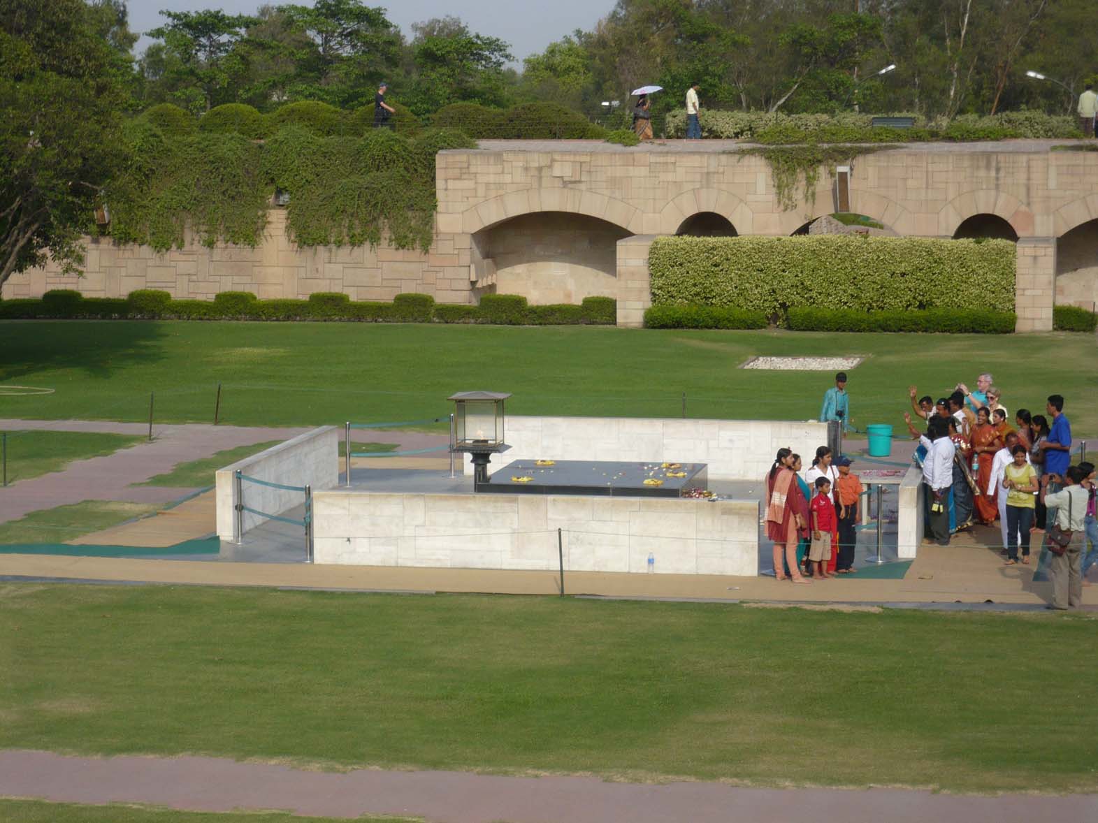
I’ve been to the site it is now part shrine and part tourist attraction and looks nothing like the time when Gandhi was cremated, it’s peaceful countenance belies the tumultuous emotional scenes on the day. So why is the horizon so markedly sloping? What emphasis is Bresson delivering? In the context of “Context and Narrative” what is the “take-away” from the optical aberration? What is the viewer to decide when they see that distant horizon sloping from left to right?
And what about these: http://onlinebrowsing.blogspot.com/2010/12/henri-cartier-bresson-eye-of-century.html It has to be said that the mounting of these images isn’t particularly professional, however HCB was considerate enough to provide full frame information and if that is used to guide the horizontal and, in many cases, the vertical, it can be seen that they aren’t true – but by not much.
So many of these shots have horizons that defy gravity or perilous vertiginous verticals that would have driven Le Corbusier to apoplexy.
Leaving aside Bresson for the moment and staying with Context and Narrative, there are a significant number of images that also have slanting horizons. Page 161 has the same subject by the same author from different perspectives with and without horizontal horizons and upright verticals. I am very unsure what that is telling me as a viewer.
The more I view these images the more I question in my mind the strategies for having a level or slanting horizon or vertical.
Two images from Toshio Shibata http://www.artnet.com/artwork/426065507/143415/toshio-shibata-grand-coulee-dam-wa.html and http://www.artnet.com/ag/fineartdetail.asp?wid=425283485&gid=143415
The first photograph of the Grand Coulee Damn seems to have its contents flowing into the right hand side and then cascading down through the photograph. The second might just not be horizontal?
Seek and ye shall find, there are probably ten thousand images on my shelves from Steichen and Sieff to Beaton and Bailey and the more I look the more I find anomalies that now defy my understanding. These geometric inconsistencies vary from minor angular variances to calamitous physical constructions. I am clear in my mind that if the subject/object of the image is "on a slant" there has to be a reason - again either a mistake or a compositional reason - but I am less sure about the sub-ordinate geometric references. And my reasoning is as follows:
Once a photographer reaches a level of visual literacy then he or she can see that their image has a vertical or horizontal that is "off" and may elect to leave it as is. Leaving it may be done for many reasons, some examples might be: veracity - this was how the image was revealed at the time. The photographer could have recourse to the editing suite and "fix" the offending visual non-sequiter, but decide not to in the vain glorious pursuit of truth. Alternatively it may be, as discussed above, left to add a dimension - to "knock" the viewer into looking at a subject or situation from a fresh angle. Gursky's vision of the Rhine would look entirely different had it been visually flowing out of the picture instead of being "at rest", maybe Woglinde would have had more to concern her if it had flowed more clearly?
If I hadn't looked I wouldn't have found these "flaws" but I would like to understand them better, I would like to better develop my vocabulary, because if I am to communicate through imagery, I need to understand the language I use. If the language I use isn't understood by me how can I expect to deliver a message through semiotics that rest in the image, whether by intent or ignorance. I had thought, and still do to a large extent, that the first priority is to get the "shot", to capture the "moment", to train the eye to allow it to reveal a truth or, just as importantly, a lie. As long as the object is clearly defined then the subordinate clauses in the story will be just that, secondary to the plot and can be fixed if necessary in the post production phase. The professional should be trained to such an extent as to pull together as many of these extra dimensions that surround the main object of the image and, if that object is the sea or lake or the Bonneville Salt flats, then it is likely that the top and bottom frame edges should be parallel to the critical horizon in the shot. But whilst the professional "knows" all of this I feel it should be secondary to the capture of the image. Ensuring that the shot is made is the most fundamental part of the photographers brief. To that end Bresson, I feel, made sure he got those shots of Gandhi's funeral pyre, the photographs suggest to me that the focus of the energy/emotion/ and evocation of the moment was what occupied his eye at that time. A vista which combined both the flames of the pyre and the fire of the mourners. The horizon probably didn't feature to him then and certainly doesn't to me now (except as I look at photographs I see the damn things in every shot and can't stop checking with the frame edges). The modern photographer has more tools than Bresson had. HCB had a Leica and his "press" images were probably not printed by him anyway. Today's photographer can always revert to Photoshop to "correct" the image but that will alter the veracity of the image as defined when the photographer trained the viewfinder to the subject and maybe that doesn't matter. Maybe the fact that the handheld image is never likely to be truly horizontal and that the truly horizontal image is indeed the "photoshopped" image, cleaned up after the event - how many of us can truly claim to hold a camera absolutely true?
When Pythagorus viewed the Aegean horizon and saw it was flat, it provided a glorious base to his theorem for right angle triangles. The absolute world of mathematics, of ninety degree angles and perfectly straight lines is naturally a unambiguous science, a world away from what I think the art of photography is. I am looking for direction and light in this subject. Any offers?
Interesting reading John which raised quite a few points in my mind upon which to ponder. Uneven horizons don’t usually impinge upon my consciousness so I must just accept them as is. What does this mean on a psychological level given that I chose to work in a profession which often deals with disorder and chaos? Maybe other people need level horizons so they can ‘keep things straight in their minds’.
ReplyDeleteCould it be that Da Vinci used some kind of model tableau for the last supper. The floor was uneven therefore the table sloped.
I looked at the allotment photographs. My eyes went first to the lopsided hut and that’s where they keep going when I go back to it. Certainly, the earth at the back isn’t level but then can that really be called the horizon? To me it looks more like a hillock – a random collection of earth grown through time. I remember having some discussion about horizons following comments upon one of my flickr photographs. This was that the horizon is level because it’s where the land meets the sky – as you write in your first paragraph. A hillock is more like a spot erupting from skin – a small part of a larger whole.
I could go on you’ve certainly got me thinking!
Catherine
Thanks for your comments Catherine. I'm struggling to get to grips with this. The allotments pictures for example:on page 161 the top left is "leaning" to to the left. The top right picture is "straight" and the bottom one "maybe straight" (but I don't think so). It is not to with the "levelness" of the background horizon line, rather it is the tilt on the camera when the shot was taken. What point was he making?
ReplyDeleteDa Vinci painted a sloping table - he knew what he was doing when he did so. Why? Perhaps I should have a go at the Art history module