As it is a personal training i.e. health based service she offers the images need to be bright/healthy/active. I chose a few venues, the grounds of Blenheim Palace, the fields near my home and my lounge and back garden - this will explain the differences in the location. For all of the images I wanted to have as simple a background as possible, to focus the eye on the subject - be it Rebecca or the equipment. I used fill in flash on a number of the outside shots as it was quite bright and from the selection below I downselected a set for her to pick from.


From which (and a few more edited down) came the following downselect:


From which the following were selected:


The portrait of Rebecca was not my favourite of the downselect due to the distant background (which I had attempted to keep out of focus where I could) adding some distraction. The indoor shot using the ball and weights has too many distractions, but I had thought she would want me to crop her head off! I also had to edit out the CD rack to the right as I thought she would only want her central section!

 The "tummy" shot I had to colourize her skin to give it a healthy glow! The ball, weights and "stepper" worked quite for me, the elements all in clear focus and the foot "out of focus" showing work, I purposely shot it at an angle, which I also think works here.
 I wanted Rebecca's feet to clear the horizon in the "jump" shot to emphasize height and agility, whereas the heart monitor is basically a "product" shot, although shot off-centre and with a healthy glow to it I think.
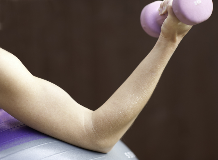 The last two shots were about strength with the focus on the arms. Rebecca's biceps are that pronounced - no photoshopping needed there.
After some comments by Catherine about including my preferences I thought I would update the blog with thoughts:
The only major difference was the portrait I had downselected these other three portraits. They all seemed to sum up "healthy" & "fit" and attractive. They all had no distractions at all in the background, the "stepper" shot suggested work to me and the "tools" shot was an alternative only.


Goodness - what a choice. I would have been interested as well to see what your selection would have been.
ReplyDeleteLooking forward to seeing how P&P develops for you over the next few months.
Catherine
Catherine, what a good idea, I should have included my choices, and said why! I'll try and update the blog sometime soon. Thanks.
ReplyDelete