Sunday, 22 July 2012

On Reading by Andre Kertesz


A long time ago, it seems now, I was sitting and reading in the foyer of a antiquated city centre hotel in Santiago. The book was “Great Expectations”. I wanted the taxi that was take me from the hotel to an office by the ocean to be late as I was nearing the end, but this was not long after Pinochet and order was still the order of the day and the taxi driver was on time. There were still a few pages left, which I would read at the airport, but I knew the ending as I had read the introduction. The introduction to the Penguin classic edition not only told me what the ending was, but also what the original ending was – much bleaker, much tougher and Dickens was talked out of it by friends, so not only did I know what the ending was I also knew what wasn’t the ending. I vowed thereafter to never read introductions or prefaces to any book I read until after I had read the book it was introducing.
The word that came to my mind, as I looked through the photographs in this wonderful little book, kindly loaned to me by Catherine Banks, a fellow student, was transformative, so I was interested to find that in the short introduction that I read, after I had looked and studied the three score and more reproduction photographs, the word “transformative” as a key descriptor in the analysis provided.

Where I agree with Robert Gurbo, in his preface to the new edition of Andre Kertesz’s “On Reading”, is in his use of the of the word “transformative” when he describes the power of the written word that provides the central motif of the sixty six duotone prints contained in this beautiful little book. The written word that features as a sur-text on each of the photographer’s works that, as Gurbo informs us are better reproductions is this edition than the previous editions due to the improvements in print technology. And, whilst the subject of each photograph reflects the title and most of the photographs are of persons or people reading, it is here where I think Gurbo doesn’t go quite far enough.
Kertesz the son of a bookseller in Hungary wasn’t an accomplished oral communicator, whilst he lived in France for a period after he left Hungary he hardly spoke the language - so he needed to rely on his visual language, the photographer preferred to let his images provide the narrative on the life that he led.  Roland Barthes said of Kertesz that he he produced "a photography that thinks"in the preface to  "Kertesz - Michael Frizot/Anne-Laure Wanaverbecq, Jeu de Paume reviewed here. I agree with Barthes, these photographs provoke thought as much as they are about thought.

It is easy to imagine short essays on each of these images, such is their individual strength but put together as they are, their collective energy is more than the sum of their parts. For this viewer of these photographs it is the transformative power of the idea and their concomitant thoughts that resonate individually and collectively throughout this book. Words seem to me to be the sub-text in these pictures, fluency in different languages allow different interpretations of words and whilst there is the visible written word in many of the photographs it is the ideas expressed in them that matters. None more so than "New York City, July 30, 1969"; a photograph of a large beetle on the book cover of the complete works of Voltaire whose ideas helped shape the Enlightenment and some of the great thinkers from the late eighteenth century to this day.

One of the early shots has two students with their backs being supported by the same tree in “Washington Square, April 18th 1968”. Precisely a week after the Civil Rights Bill was passed into statute by Congress, Kertesz takes a picture of two students; one white and one black. Two students united by the foundational solidity of a tree routed in the soil of the United States of America, but also by concentrated thought as they regard, each of them, the written word. It is the compositional idea of the shot that exposes an idea of an idea stemming from the subjects that defines the beauty of this photograph.
The last photograph “Hospice de Beaune, France, 1929” has an elderly matriarch sitting up in bed, wrapped against the cold with a shawl and headscarf, she reads with obvious intense concentration. The subject’s pillows are bolstering her in her pursuit of more words and ideas to the almost exclusion of life itself. This photograph has the subject looking in towards the spine of the book, regarding all that has been printed before. And when she has finished reading there is a bell pull above her that she can inform of her decision to stop reading once and for all.

Friday, 20 July 2012

East 100th Street

The seats on the return train from the Bank Street Gallery to the Shire were limited. I found a seat, after some squaddies on leave very kindly made room for me, so I look that old eh? The seat though was facing to the rear of the train – it meant I was travelling backwards, not my favourite direction as it tends to engender in me a slight motion sickness. I started writing my notes of the visit to Tanya Ahmed's exhibition in manuscript form, both because I thought that it might help with the slight giddiness and also because I like to write with a tool in my hand, rather than the springy black squares that demand constant attention to detail, Word constantly self-edits in it's infuriating "assistant" way, writing with a pencil is freer, less need to worry about how the punctuation looks – or whether the rhythm of the words fall into any pattern, it lets the ideas work. Typing detaches the typist from the words; it provides a remove from the construction of the sentence, the paragraph, the notion and the feel of piece. Editing the manuscript is best accomplished with a re-write, editing the typed page is done by painstaking viewing of the screen, or, as my preferred method – print it off and highlight, highlight, highlight and then delete.

Photograph reprinted by kind permission of the artist Tanya Ahmed


The Bank St Gallery has two rooms with Tanya’s work in it – both on screen. The New York marathon pictures were all seemingly taken from a similar perspective – I think about 5 shots – with exposure times designed to blur any passing runners. The crop (of which more later) was on a piece of inner city road, with very little else to situate it anywhere in New York, or New York State, or indeed North America. These runners could have been anywhere; we had Tanya’s words to place the action, these blurs of coloured form, in motion from right to left. There was no music to accompany the projected images, which very slowly turned one onto the next – but the extraneous sound from the adjoining space, where Tanya’s other show was being staged, somehow seemed to add to the experience.

“It’s a body of work, however it is diced and sliced. But I still recognize it as my work..” I paraphrase Tanya’s words. I wondered about this as I travelled backwards to the Shire. I didn’t see the first OCA sponsored exhibition of Tanya’s work, so I only had the OCA website to compare with. I could of, perhaps should of, visited east100thstreet.com to have gotten a perspective “but hey” I hear her say “no perspective is a perspective!”. John Clark who is part of the Gallery in Bank Street suggested that he and Andrew Conroy (photographer in residence at the gallery) are both fans of architecture photography (not in the pure sense, buildings perhaps, inhabited spaces..) – so, no surprise there were only two shots with people in them - see above, and they are both as accent and anonymous (unless we discount the “can-guy” that Tanya pointed out that was missed by John). I, like Stan and Rob (two other OCA students up for the afternoon) expected something maybe a little more like the OCA show – people in their rented apartments. It was as an “outsiders view” of an outsiders view, was how Clark described the curation.

The set of images were a projection of a city anywhere, the insularity of city life, compartmentalized and insulated. The monochromicity helped and the background soundtrack that was termed sombre by one of us helped to generate a reflective sense in this viewer as the images flicked through on a repeated loop. Not being able to compare the earlier set to this series, I can only add my reaction to both the images seen individually today and as a set as curated by the gallery. John and Andrew had a clear idea of how they wanted these photographs to be viewed, both as a series of images and, by the use of the screen which dictated how the viewer interacted with them, the distance we (the viewers) would need to be; no need to get near and peer at the print. From my perspective the gallery succeeded in projecting a sense of insolation. The sense of detachment that seemed to emanate from these photographs offered, if not a cold view of city life, then certainly one which wasn’t overly inviting; their word was “dystopian”, which on reflection seemed about right. The screen did seem a little contrasty compared to the images in Tanya’s book that she kindly brought for us to look at and compare, this is almost certainly because the screening room was darkened and the book of course had to be viewed in the light. The soundtrack also contributed to the ambience of an almost other worldly atmosphere from almost any city anywhere. I think the gallery did a very good job.

So both exhibits could have been from anywhere, the New York marathon set perhaps more so, unless there are typologists of manhole covers viewing, it is likely that the scene could be repeated wherever these road races are run. The East 100 Street set had some with fire escapes that are also found in Leeds and Bradford - John informs that the same architect may have been responsible. So more pausing for reflection.

Tanya was dismissive of the technical accomplishments in what was clearly a set of superbly rendered images, which when viewed in the book at the pace that I decided and not what the gallery had determined for me, allowed me to see the quality, the subtlety and the eye (Tanya’s) that had expertly cropped the image to suit the narrative of each image. It is a book that will probably sit on my shelves very nicely.

The discussion after viewing had on it’s agenda curation. John who had joined the four OCA students, informed us about the gallery thought processes, how detached editing can inform the viewer in many ways, distorting the original intent of the artist, perhaps even delivering a completely different narrative. Though it has to be said that the gallery largely succeeded in it’s objective, they weren’t fans of the way the original exhibition was staged and they had the opportunity to make their own proposition. I think they did a very good job, but looking at the body of work – that was limited by the number of shots in the book, I would have had a completely different take. As Clark said, a different take would not have been wrong, but right in a different way, he also stated that he was "shit at editing his own work" and had given up, preferring to work with other artists to refine and draw conclusions from their bodies of work. I know editing is tough, whichever method is chosen. Delete, delete, highlight or if I was looking as The Bank Street Gallery did with that pool of resource, what story would I want to tell?

Returning south I found myself wondering what Tanya thinks. Travelling backwards towards a destination is an odd way to reach your goal. Tanya has seen this work exhibited twice and both times the work has been acclaimed, the source of this praise must surely be in the excellence of the work at its core; from where a skilled curator can seemingly project a narrative theme almost at will. Looking backwards over this process perhaps there are a number of other stories to recount from this body of work that situates this part of East Harlem to Anycity AnyState.

Wednesday, 18 July 2012

Thoughts on Assignment 4

A sense of a place.

I have discussed with my tutor about trying to depict a funeral director's establishment for this assignment.

Aside from the brief at this stage as I'm trying to get some thoughts together. I was engaged to do a couple portraits for the owner of the business and a staged "bereavement shot. These pictures will be used to refresh their web-site. I've done these and they have been enthusiastically received. Part 1, job done.
Whilst I was travelling to the building I twas thinking about the next assignment and how the "place" might fit into the assignment brief. My thoughts, with regard to sense, in relation to a funeral director's estblishment, came up with:

Respectful,

Quiet,

Honourable,

Spiritual,

Calm,

Authoritative,

Reassured,

I've only been to one of these places once before after my father died. Then I was relieved to have had most (if not all) of the procedural worries taken away; in short the person in the funeral parlour took all of the burden that he could away from me so that I could grieve with my mother and family.

Reliable,

Solid,

Sure,

Experienced.

The owner when we discussed the project was at pains that no names (of the deceased) could be seen in any pictures I show, he also stated verbally and in an email:

"I suppose I should mention that whilst Ken and I are very lighthearted around the office Jerrams Brothers has a culture of always being dignified and respectful where the deceased, bereaved and their families are concerned and I would ask you to bear that in mind when visiting our premises and when taking photographs."

That he felt he needed to ensure I understood fully the ethos of his practice was testament to his professionalism. However I wanted to be able to show the presence of the people if at all possible. With the employees that would probably be fairly straight forward, but when I looked around there were names in a lot of places. The fridge right holds up to four people and had three in it when I took the picture. In photoshop I have attempted to "rub-out" the names in such a way as to mimic the process with a cloth - as would be done in practice. The brown cardboard boxes at the right of the shot contain the ashes of deceased people, with their details printed on the labels. I don't think these can be read, although I have another shot where the boxes are much bigger and much clearer, which will give me another issue to resolve. I wonder though with the fridge whether it has the appearance of occupation in the treatment I have used?
My first expedition to this "place" has me asking more questions about the pictures I have taken and how far further I need to go to go somewhere near the brief for the assignment.
The clothes to the right are those that will dress one of the deceased inside the fridge, one of those whose name I have "rubbed-out/erased". I am aware of the awfulness of the prose.


Monday, 16 July 2012

Two views

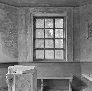
The "clear shot" was what I saw. It was, it is, a window to the world from a folly in Rousham. Though the window is obscured by dirt and grime, dust and cobwebs it therefore doesn't allow a "clear view". The "unclear view", with the camera being moved, quite undramatically compared to other movements I tried in this series, appears to let a brighter, clearer light through the window?


I'm not valuing one photograph above another, it's just by exaggerating the difference and placing them side by side, the same structure tells different stories. Solidity and structure with references in the foreground and staid composition as opposed to the image which appears to have been released from any form of stricture. Looking for the presence of people, both appear to have them for this viewer; the lower one with lots of ornamentation on the walls, the architecture os the seating and the "mock" sarcophagus. The blurred image appears to draw me through the window, to the light. I know it's a regular window, it is therefore manufactured therefore it has the presence of people.
Just thinking out loud


Friday, 13 July 2012

Sugimoto and the polar bears


Some years ago in the MOMA Oxford I looked at a triptych of Sugimoto seascapes, I am not sure whether the one here was one of them, all I know is the "image" of them has remained with me. I found the beauty of the sea, set in a steel grey sky as beautiful as the vision to want to record it.


Sea of Galilee, Golan, 1992 (gelatin silver print on paper)
Sugimoto, Hiroshi (b.1948)
The Israel Museum, Jerusalem, Israel  - Bridgman
My tutor recommended that I look at Sugimoto's work, and in particular his work on film theatres, as my work seems to focus on performance. I am glad that I was steered towards this work, I ordered an expensive book and have been looking at the images for a a while now.


In his opening essay on the work of Sugimoto - "Impossible Photography"1, Kerry Brougher writes:

"In a bleak, forebidding landscape, where a pale sky and snow-covered ground meld together to produce a white void, a polar bear hovers over its victim. Caught just after the kill, the photograph shows the beast poised over a freshly dispatched penguin, ...."

I carried on reading, but there was something that didn't quite ring true, something about penguins and polar bears. I'm no naturalist but I though that polar bears were northern hemisphere and penguins in the south. Perhaps the title "Impossible Photography" held the clue - the title was a remark on the impossibility of the photograph or perhaps he hadn't looked at the print by then. But I did and I noticed there was no penguin, it was certainly a depiction of a polar bear and his kill, but the newly slaughtered animal was clearly a seal. The seal's relationship with a penguin was in a more distant time when, casting Darwinian theory to the scene, the seal and the penguin evolved from sometime after the creation of the primordial soup that we all surely owe our ancestry to. So, what was going on with Brougher? I stopped reading his essay, as I wondered whether he had actually looked at the photograph he was using as part of his introduction to Sugimoto's work. I couldn't work out in my mind whether he hadn't bothered to look at it, certainly no-one in the production team had thought to question it (maybe none of them had bothered to look at it either?). In what is otherwise a wonderfully well put together, near 400 page, catalogue of his work by Taaki Matsmoto, I wonder whether he thought it irrelevant to study the work before commenting on it. Unfortunately it put all his (Brougher's) commentary on shallow footing and so I concentrated on his co-auther's contribution and, more importantly, the body of work contained in the book. Kerry Brougher has recently been named acting director of the Smithsonian's Hirshhorn Museum and Sculpture Garden, effective Dec. 22 2012, however he was Director of MOMA Oxford between 1997 and 2000 and it might have been during that time when I first saw the Sugimoto's that still resonate with me now. What to think??


I have been looking at Thomas Struth's work and the comparison I therefore make is between the aforementioned photographer's work of art galleries and museums, and Sugimoto's film theatres. Whereas the Japanese photographer appears to place his frame such that the composition is both in harmony with the architecture he was capturing and also portrays a strong sense of balance. Struth's compositions by comparison seem quite haphazard, almost clumsy. Sugimoto's theatre's are havens of peace and quietude. I am aware that might be the point, i.e. that Struth wasn't trying to create an atmosphere of peace and quiet.............................

It is Sugimoto's vision, the theatre's, the seascapes, the burning candles, the range of work included in this book that is extraordinary, extraordinary in it's range other than for one thing, which is the total absence of people. There are portraits, but they are of Madame Tussauds' figures. The prehistoric humanoids are from dioramas in the American Museum of Natural History. It seems Sugimoto doesn't do people shots.

The conceptual forms, which whilst having a strong conceptual genesis are also studies in light and form. The direct connection to mathematical models, of trigonometrical functions and formulae are no worse off by having their capture completed with beautiful rendering of light over their form, their sensual shapes that appear to revel in their curvature. The other pure mechanical still lifes, whilst being less balanced structurally speaking, are still wonderful examples, almost exercise, etudes, of light and form.

The book is highly recommended and will be a page turner for me for some time to come.

1 Hiroshi Sugimoto, ISBN 978-3-7757-2412-8 Hatje Cantz p 20

Monday, 9 July 2012

Passing the Olympic flame

It was Woodstock's day today (amongst some other towns and villages in North Oxfordshire) where the Olympic torch was run through the town to throngs of people. Our local MP, Dave, came to cheer us all along (together with a few security folks). I positioned myself close to where the changeover was about to take place and where Dave would meet the flame carriers. Generally a happy occasion, with its fair share of hawkers - I am guilty of tussling with the press who wanted their own shots of our great leader and took it as a challenge to get as near as possible. I add no commentary to these pictures - I wanted to take people in a busy situation, get them face on as well interesting poses. More of us at play. A couple of people as accent and anonymous, these shouldn't be too difficult to spot.