Monday, 9 January 2012

On the street again

Went to Sheffield to see Si Barbers work at the Banks gallery - terrific, post will come shortly. I took the opportunity to take some more photographs on the street. This is difficult!

Reviewing revealed lots of feet, lots of blur (unintended) oblique angles, with no desire for added dynamics.

Voyeurism - not a term I have levelled at myself before, but a photographer must be part voyeur. Across the aisle travelling to Sheffield.


Two images that don't quite work. The lop-sided shot on the left has a lot of blur - I was tracking the gent - but for me he doesn't stand out enough and the eye is distracted by the motiion blur. The right hand image is almost a "good" shot. More of the lady and she "might" have made in interesting juxtaposition to the mural picture she was about to pass. I'm not concerned about the angle, it stresses the "potential" of difficulty she might have.

I had reveiwed the images in camera and was struck by the number of photos I had of people looking "another way" i.e. "faceless". I decided to try and capture some faces and these two have subjects that have "caught" my lens. On the left the chap has a slightly concerned look, the young lady on the right seems comfortable about it.


Gareth and some fellow students - a respite for me - knowing I was on safe grounds!


A slightly complex image and I wonder if people will take the time to work it out - only in as much as it would inform me as to the worth of taking this type of photograph.


I caught these two studying the outdoor photography. They mirrored each other quite often, they looked, they bit, they chewed, they looked. I don't think I caught that empathy they shared.


Slightly more uncomfortable ground here. This chap was an amputee and I caught him, in step, trying to catch up with his mates who were determined to keep moving.


Again on safer ground with the OCA group, Gareth was considering one of the images, it was cold and we were about to break for the day. I'm not suggesting that Gareth was a "card". Another "nearly" shot to finish with. The "big Chief" looking down on the couple coming towards the lens. The lady has caught me taking the picture the chap just wants to get home. I need to recognise the criticality of focal depth, it can turn a good shot into more filler for the delete file. There wasn't much excuse for it either, the light was almost too good (strong disparities between light and shade), so more practicing, more time to develop technique for both the new camera and on the streets.

Friday, 6 January 2012

1st rehearsal

Curiously I felt like an interloper, not being directly involved in the production, which is odd as I have known most of them for a quarter of a century and more. They all signed the model release forms - which some jibes about being "models" and I think this procedure will help to detach me a little from them for the purpose of my project. Only one of the group questioned what I was doing, I think this is more to do with their need to get on with the job in hand.

The lighting isn't ideal, the main body of the Hall is well lit with fluorescent strip lights and the stage has another, albeit smaller, fluorescent strip - but the stage is draped in black cloth from the previous production and that is mopping up the light. So, completely the opposite of a production lighting set-up, where the focus of the lighting should be on the players on-stage. I had decided not to use flash - for obvious reasons - and had taken down three cameras; Nikon D3 initially set at 1600 ISO, subsequently moved to 3200, Fuji X100, also set at 1600 and a Pentax M3 with Fuji Neopan 1600. Looking at this now there seems a surfeit of 1600! The digital cameras were set to have a max ISO auto adjust, so were capable, depending on available light and aperture to reduce the effective film speed. I'll annotate the photographs with the relevant detail.

As can be seen I had expected a paucity of light and felt it was likely to be working on narrow depth of field, which I was quite happy with as I wanted to use focus as an allegory. There are different types of AmDram groups, some very serious, some purely social; this group is somewhere in between and the job of doing a god job with the script and intention of both author and Director is taken seriously and I've tried to capture that in the shots. There is, I have to say, also a lot of humour and laughing along the way which is something I expect to capture also - hopefully from an audience perspective also.

 Two shots of Kevin, one half of the JD's. Joint Directing has been done before at this group and is was used to bring a novice Director "up to speed" as it can be quite daunting. However in this case both Emma and Kevin are new to the role of "boss".
The shot on the left has him annotating his script f4.0, 1/30th and ISO1400.

The shot on the right has him from a players perspective, considering the action on stage. It is important to the players to have the director demonstrably taking note of the performance and how it is developing. f3.5, 1/30, ISO 1400

Pat and Jean costume/tea/general factotums sit slightly apart from the players. Their support is vital to the success and smooth running of the show. I set the focus on them, slightly differentiating them from the players f2.0 1/30, ISO 640. Mike on the right will be the Stage Manager (SM) on this show - he won't need to do very much until the "blocking" has been completed so he is doing some work on his iPhone that is nothing to do with the show and all to do with his business f3.5, 1/30, ISO100.
 I hadn't particularly noticed this before as I am normally intricately involved in the production in some way - but most people had their heads "down" looking at their scripts, making notes. This shot of Sharon places the script into sharp focus and the centre of attention. f5.6, 1/30, ISO 1600


 Similarly with this shot - the group has come together mid rehearsal to listen to the Directors and discuss - notes will be taken (maybe to be discarded at a later date). They spontaneously decide to stand in a circle while the discussion continues f2.0, 1/50, ISO200


The photograph here suggests the first "performance; there are players on stage and an audience. Something has "moved" the actors in the Hall to look up and take notice, generally they were concentrating on their scripts, but three of them were taking note of the action on stage. I focussed therefore on the players on stage rather than the "audience" f2.0, 1/30, ISO640


Back to the "group-hug". I like the interplay here between the Joint Directors and a couple of the players. Emma is talking, Jeff - in between is keeping quiet, Kevin looks on with an interested expression, whilst Dave remains detached. I tried to focus on Emma, but it didn't quite come off f2.0, 1/30, ISO320


Emma considers something here, not quite sure what it was, I wanted to get a picture of the players listening, taking on board what the JD's were saying - a notion of their "direction". These shots don't quite work. The one with Emma f2.0, 1/50, ISO 200 there aren't enough obvious listeners in the frame.


  I move around and took this other shot, there is obvious concentration on Emma's words - even a part of Kevin, but no Emma, which sort of sells the shot short f5.6, 1/25, ISO 1600. So the focus in the frame is to capture their focus, their intent on what the JD's want from them and their performances. (Kevin's demeanour albeit cut in half is more positive than before)


And finally a "performance" shot. The most they managed to get on stage in the evening.

A lot for me to take away here. I will be able to show progression, as the players pick their heads up, as the play picks up, as the other various components to make a show come into play. Next rehearsal is next Thursday, Sundays start 22nd January. February will be an energetic period and the show goes on 29th/30th and 31st March.

Thursday, 5 January 2012

The Family of Man

The Family of Man, Created by Edward Steichen, Museum of Modern Art, New York

It is now 60 years since the start of the process to what has been called (and probably rightly so) the greatest photographic show on earth - and still probably has claim to that title

Three years curating over two million photographs.....Reduced to 503 photographs, 273 photographers and from 68 countries! (see Bill Jay's essay below). And now running the risk of being accused of institutional racism. 10 photographers were from non-western countries - 7 of them from Japan - the bulk of the photographs stemming from the USA and Western Europe.

That being said the images have been curated to show the various phases of life; a universal life including births and death, love and love-making, joy and pain, work and play. These emotive scenes - all set before the date of the collection 1955 (so 1952 and before) - were therefore, both timeless and already dated. The photographs and photographers include some of the most famous that have existed, however they (collectively) have a look of the past captured, even in the universality of the topics they cover.

If there were a Steichen alive today and he was asked to produce another "family of Man" it would be more inclusive, cultural and political sensitivities would ensure the requirement of more imagery from Africa - of the 6 or 7 photographs from that whole continent in the Family of Man were all taken by an American, of the 3 or 4 from China only 1 was taken by a Chinese photographer and of the few from India, Satyajit Ray contributed only 1. Would the latter day Steichen ask an Indian to take some pictures of Cincinnati? It is unlikely he would ask an Iranian to do the same - despite the reputation of photography from that country. Yes, I know I'm being naive. It is worth a look, the book has hardly been out of print since the exhibition opened.

For a more comprehensive re-appraisal of the exhibition and a different view of the outcome have a look at Bill Jay's essay on the subject - he is one of my favourite writers on photography and wrote this in the late '80's http://www.billjayonphotography.com/Family%20of%20Man%20Exhibition.pdf

What did amuse me however is that the catalogue - which might be different from the exhibition print - contains a Bresson India print that has been cropped and "levelled"! "Kashmir" p161 - if you have the book.

See http://www.afterimagegallery.com/bressonsrinagar.htm which is a copy of the original

Wednesday, 4 January 2012

The Reunion

The following is my initial idea for Assignment 2 People and Activity. About 10 images. Plan and execute a set of images of people in some form of of meaningful activity. This could be work, sport, a stage performance (music, drama), or at a social event.


The local AmDram group - see below - are putting on "The Reunion" by Peter Gordon. I know from experience from directing many productions that there will be ample opportunity to provide a lot of the exercise requirements for assignment 2, however I plan to also complete exercises for the course outside this production as well. But I wanted to set the scene, as it were.


In my mind at the moment I plan to cover the process from read-throughs to performance, covering rehearsals, technical, make-up, costume, backstage and set building.


I would like to present the points of view of the director, and of the players, the production assistants and the audience (I won't be there on the final performance as we have a wedding to go to - so the post production party will be missing). The group meet and rehearse every Thursday and Sunday with set building Sunday morning.


I expect to use both film and digital capture as I suspect that these will offer differing viewpoints. My tutor recommends a "model release" agreement with all the likely suspects. I had thought about that and will take some with me tomorrow night for the first take. I know the advantage for me is that there will be a number of willing volunteers and in a confined space, but I do feel there will be a challenge as my role will be subordinate to the roles of the Joint Directors. Joint directing is an interesting concept; I have directed quite a few productions and the players, certainly initially, look to the Director for "direction" and whilst it is true that a play does develop through the process of rehearsal as the characters develop and grow into the play as a whole, these joint Directors will need to have a strong vision that they can hold to or, a strong faith in each others ability to test the way in which the play develops. It may offer a dynamic if they aren't in full synch' on it, I hope it doesn't though!


Our Directors, shots taken from previous productions  The group has a web-site, something that I initiated when I was actively involved, and I'm afraid that I currently feature on the landing page - I will come back to that on a later post with some self portraiture!
The Middle Barton Drama Group - http://www.middlebartondrama.org.uk/


For reference here is a link to the play, it isn't the deepest play that the Group has ever staged. It is my experience that when a write-up says hilarious it often isn't, but I hope to capture the humour. http://www.petergordonplays.com/Reunion.htm


Cast: 4 male, 4 female.

Set: Single interior. Back room of a pub, present day.

It's good to meet up with old friends ... or perhaps not!

When Nigel arranges a reunion in the back room of a pub, he is optimistic of a good turnout. Whilst the numbers disappoint him, he soon has his hands full when a motley middle-aged threesome turn up, bringing with them assorted wives, girlfriends, prejudices, and resentments that have simmered for the last twenty-five years. As the evening unfolds, the men are forced to reassess their old alliances and reflect on their lives, as the women are increasingly struck by the futility of the whole exercise! Comedy and confusion combine in this hilarious but poignant story of 'small people' in a 'big world'.

People unaware

Wary of creating a hostage to fortune I though I would record my first deliberate attempt to capture people unaware. Alison's birthday is looming and I needed to get the card; Sainsbury's is closest and I took my new (unobtrusive) camera to provide the capture. Serendipity must be a part of the potential for success - but it is clear from these first few images that technique, like all skills, is something to be worked at. I probably won't post all my attempts, but as a matter of record here they are - warts and all! These seven frames are all that I took.

I'm moving, let alone the subject!


This one sort of works, but I'm not close enough, though I like the lines.
A better framing might (would) have helped a lot here.
 The subject is entering the frame from the right!
 Closer, but no cigar!
 The subject is, again, on the right - though the conversation on the left would be more interesting if I was closer. Clearly I need to frame the images better.
What can I say! I'm not even sure why I took this shot or whether I was aware that it had been taken, though the takeaway is that the camera strap needs to be carefully monitored!

I didn't feel uneasy about taking the shots but I was acutely aware that I had the camera in my hand, albeit at around waist level. I had planned on taking more shots in the car park, but there wasn't anyone around.
I will take the camera - a medium size compact with no zoom - with me on a regular basis. There can be no substitute for experience and that is clearly what I lack at the moment.

Tuesday, 3 January 2012

Kertesz - Michel Frizot / Anne-Laure Wanaverbecq, Jeu De Paume

You know how it is, you put someone on a pedestal and then you either meet them or read about them and what you subsequently find out about them either confounds or compounds your previous view. Probably because you didn't really understand much about them in the first place and your knowledge came from too narrow a source. How does the saying go? "Too little knowledge is a dangerous thing!".
This book is a large and superbly put together tome, some 350 plus pages that delivers the 3 1/2 (I'll explain shortly) phases of Kertesz's life and 100's of his images all beautifully portrayed and sensitively curated.

Roland Barthes said of Kertesz that he he produced "a photography that thinks" preface page 238. I would be immensely proud if anyone ever said that about my photography and it was John Szarkowski who said "The vision they (Kertesz and Lartigue) share belongs to no school or aesthetic theory, but to photography itself" .  Kertesz and Lartigue were born three weeks apart in the same year 1894; both were amateur photographers - in that neither had been formally trained, Kertesz being proud to call himself an amateur through his life time.

Kertesz spent the first phase of his life in Hungary, served in the trenches in the first war, which left emotional and physiological scars for the rest of his life. But he took his camera into war and unlike virtually all other nation states at the time Hungary allowed their soldiers to take pictures. Despite initial family concerns he finally decided on photography as a means to earn a living and his family supported that decision and helped fund his move to Paris and his second phase. In Paris - where he hardly spoke any French - he fell in with a group of Hungarian artists and developed his photography and technique 'till in 1936 he moved to New York to begin the last phases of his life. He lived in Paris for only 9 years, but those years remained in his memory for the rest of his life as the most productive, the most enchanting of his life. New York was initially depressing and until he gained his US citizenship in 1944 very limiting from a work and artistic aspect. It has to be said that Lertesz never learned to speak either French or English to any great extent, indeed Hungarian contemporaries have stated that he wasn't that fluent in his native tongue  but he certainly expressed himself through his art.


Fork, 1928 (silver gelatin print) Kertesz, Andre (1894-1985) Bridgeman
This, one of Kertesz's most iconic images tended to suggest that he was aligned to the Surrealist movement - something he always refuted saying "I have never just 'made photos', I express myself photographically."


Continual searching for new expressions, Kertesz explored the Paris streets by night and certainly inspired Brassai who once, famously said of Kertesz - "Whatever we (Brassai and Capa) have done, Kertesz did first".


Notre Dame at night, Paris, 1925 (silver gelatin print)
Kertesz, Andre (1894-1985) Bridgeman


His final phase came in 1963 when MOMA, under the stewardship of John Szarkowski, awarded Kertesz with a one man show. The award was initially discussed with Steichen, Szarkowski's predecessor, but they didn't see eye to eye. Szarkowski then curated the "The Photographer's Eye" in 1964 which had 6 images each by Lartigue and Kertesz only Mathew Brady and "unkown" had more entries, quite remarkable when less than 10 years previous Steichen never even asked Kertesz to submit work for the "Family of Man"exhibition (but there have been many things said about the content of that event and subsequent publication!). Kertesz was able to live comfortably now and found a new lease of life, with shows and books and recognition.


Around Gracie Mansion, New York, 1948 (silver gelatin print)
Kertesz, Andre (1894-1985) Bridgeman


It is difficult to describe after looking at Kertesz's images through these phases how clear the melancholy  pervades his work during the American phase and how that improves when he finds "overnight success" in 1963/4. It is also curious how the patronage of one man can change a photographers fortune - the same is largely true of Lartigue post his one man show at the MOMA.

Finishing the book compounded my view of Kertesz as a master photographer who always extolled his status as an amateur photographer, who always strove to develop ideas and push his own boundaries, inspired countless subsequent photographers and is still an inspiration today. I haven't  remarked on his abstract work, nor his reportage, nor the other genre's that he seemed to excel in as well.
Reccomended

Monday, 2 January 2012

On the Level – Pythagoras and the photography of Henri-Cartier Bresson (and others)


The clear light and unfettered vistas of the Aegean Sea have inspired many artists and thinkers across the ages and from the island of Samos, Pythagoras and his followers were amongst the first to postulate that the earth was spherical and not flat. They also suggested that the sun, the moon, the earth and all the other celestial bodies in the firmament emitted their own signature “hum” and whilst they may or may not be right about the latter, it would appear they were certainly on the right track with the former. Through ancient Grecian eyesight and even the widest of modern wide angle lens at sea level, the aqueous horizon will produce a flat and level horizon – lens aberrations not withstanding. The sea is of course not flat – unless you prescribe to the flat earth society – it follows the natural curvature of the earth but, and this is important from a compositional and constructional viewpoint, it does not slope. The sea, the land and its inhabitants will adhere to the surface of the earth as a direct result of the elemental force of gravity, for which we have Galileo to thank nearly two millennia after Pythagoras.

Some of the earliest known graphic depictions of the land, “landscapes” as it were, were frescoes on Minoan Greek villas, but the clever Minoan painters tended to concentrate on the foreground interest, minotaurs, athletes, warriors and beautiful princesses etc, thereby relegating some of the contextual narrative opportunities, such as, for example, horizon credibility, to the classical imagination.

These Minoan frescoes had one thing in common with today’s printworks, and that of the vast majority of artists in the intervening years, which is the encapsulation of the image is held within a frame, a border of some sort. This border then references the eye to the flat and horizontal, and it’s orthogonal counterpart, the vertical. The viewer to the print, whether it be a rare Caravaggio that actually depicts a horizon, or a Turner, will be able to locate a reference for the eye. The painter can construct the image in their own making by choosing what to include and how to portray it, the truth coming from within the artists imagination rather than from without.

There are, though, some interesting aberrations in classical art worth a second look, taking a moment to consider what the intent was behind the construction of some well known paintings. For example what about Da Vinci’s “The Last Supper” or “The Mona Lisa”; both of these paintings have dominant, or sub-ordinate horizontals that aren’t level or flat? “The Supper” has a table that slopes from left to right, “The Mona Lisa” has what to all intents and purposes is a background water view that is, apparently “flowing out of the picture quite alarmingly. Leonardo was a bit of a renaissance polymath and new a thing or two about the theorems conjured by Pythagoras. These were painted, not photographed. Da Vinci knew what he doing (or at least his apprentices did under his supervision), most of the rest of his works have horizons, or at least the dominant horizontal structures that are “dead” flat, a window sill, a handrail, “The Annuciation”, for example, has both horizontals and verticals perfectly plumb! But not these two. “The Last Supper’s” table slopes. I thought maybe it was the table cloth, but on inspection the table is higher on the left than it is on the right. Jesus is central - surely he should be "higher" than his eating companions? Around him are his disciples equally set, six on a side with, naturally, Judas on his immediate left and, to confuse things even more, the figures also slope from left to right, placing Bartholomew (wide left) higher than Jesus! What was Leonardo thinking? What is the viewer to make of that? As for “The Mona Lisa” – I can’t understand why there would be such a pronounced slant on that, it was painted though before Galileo pronounced his findings on gravity.

I am informed/told that the inclusion of a sloping horizon (or dominant horizontal structure) in a photograph is either a mistake or a deliberate intent to add a “dynamic” into the image. I am unsure what this “dynamic” is in many photographs I have looked at; this “unsurety” seemingly comes from some critical naivety in my understanding of compositional construction. Could it be, I wonder, whether this variable – this dynamic – is whatever I, as a viewer, decide it could be in the frame that the photographer has taken? In other words could it add a layer onto the image, is it indeed part of the image? A slant? An adverb? A modifier of the fundamental image that adds a layer of (additional) meaning, appending an attribute; emphasizing an aspect of the image that helps to drive home the narrative of the image? Any of this? All of this?
If so, what does the horizon inform us in Henri Cartier Bresson’s “India, Delhi 1948. The cremation of Ghandi on the banks of the Sumna river”? ref Context and Narrative by Maria Short, p111, also shown here: http://www.sidileak.us/2011/02/indias-superpower-euphoria-ccxlv.html.
Lets consider the image for a while and what we know of the day. India is in a state of national mourning, its spiritual leader has been murdered. It would seem that the nation wants to bear witness to the passing of the man – the “father of the nation” - who has led them from subservience to independence and that if those billion people could be there they would be. We know that HCB had interviewed Gandhi a few hours before, and we know that he was therefore caught up in the fervor of the moment. We know that HCB struggled determinately to get to a position to photograph the pyre - he has written on this particular subject. We know there were hundreds of thousands, perhaps millions, of distraught Indians also there to pay homage. 

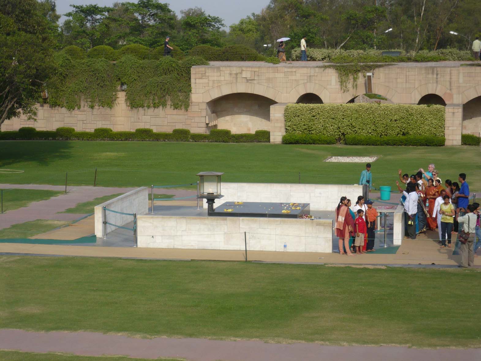
Raj Ghat Picture taken by Alison Umney
I’ve been to the site it is now part shrine and part tourist attraction and looks nothing like the time when Gandhi was cremated, it’s peaceful countenance belies the tumultuous emotional scenes on the day. So why is the horizon so markedly sloping? What emphasis is Bresson delivering? In the context of “Context and Narrative” what is the “take-away” from the optical aberration? What is the viewer to decide when they see that distant horizon sloping from left to right?


And what about these: http://onlinebrowsing.blogspot.com/2010/12/henri-cartier-bresson-eye-of-century.html It has to be said that the mounting of these images isn’t particularly professional, however HCB was considerate enough to provide full frame information and if that is used to guide the horizontal and, in many cases, the vertical, it can be seen that they aren’t true – but by not much.


So many of these shots have horizons that defy gravity or perilous vertiginous verticals that would have driven Le Corbusier to apoplexy.

Leaving aside Bresson for the moment and staying with Context and Narrative, there are a significant number of images that also have slanting horizons. Page 161 has the same subject by the same author from different perspectives with and without horizontal horizons and upright verticals. I am very unsure what that is telling me as a viewer.

The more I view these images the more I question in my mind the strategies for having a level or slanting horizon or vertical.


The first photograph of the Grand Coulee Damn seems to have its contents flowing into the right hand side and then cascading down through the photograph. The second might just not be horizontal?

Seek and ye shall find, there are probably ten thousand images on my shelves from Steichen and Sieff to Beaton and Bailey and the more I look the more I find anomalies that now defy my understanding. These geometric inconsistencies vary from minor angular variances to calamitous physical constructions. I am clear in my mind that if the subject/object of the image is "on a slant" there has to be a reason - again either a mistake or a compositional reason - but I am less sure about the sub-ordinate geometric references. And my reasoning is as follows:
Once a photographer reaches a level of visual literacy then he or she can see that their image has a vertical or horizontal that is "off" and may elect to leave it as is. Leaving it may be done for many reasons, some examples might be: veracity - this was how the image was revealed at the time. The photographer could have recourse to the editing suite and "fix" the offending visual non-sequiter, but decide not to in the vain glorious pursuit of truth. Alternatively it may be, as discussed above, left to add a dimension - to "knock" the viewer into looking at a subject or situation from a fresh angle. Gursky's vision of the Rhine would look entirely different had it been visually flowing out of the picture instead of being "at rest", maybe Woglinde would have had more to concern her if it had flowed more clearly?
If I hadn't looked I wouldn't have found these "flaws" but I would like to understand them better, I would like to better develop my vocabulary, because if I am to communicate through imagery, I need to understand the language I use. If the language I use isn't understood by me how can I expect to deliver a message through semiotics that rest in the image, whether by intent or ignorance. I had thought, and still do to a large extent, that the first priority is to get the "shot", to capture the "moment", to train the eye to allow it to reveal a truth or, just as importantly, a lie. As long as the object is clearly defined then the subordinate clauses in the story will be just that, secondary to the plot and can be fixed if necessary in the post production phase. The professional should be trained to such an extent as to pull together as many of these extra dimensions that surround the main object of the image and, if that object is the sea or lake or the Bonneville Salt flats, then it is likely that the top and bottom frame edges should be parallel to the critical horizon in the shot. But whilst the professional "knows" all of this I feel it should be secondary to the capture of the image. Ensuring that the shot is made is the most fundamental part of the photographers brief. To that end Bresson, I feel, made sure he got those shots of Gandhi's funeral pyre, the photographs suggest to me that the focus of the energy/emotion/ and evocation of the moment was what occupied his eye at that time. A vista which combined both the flames of the pyre and the fire of the mourners. The horizon probably didn't feature to him then and certainly doesn't to me now (except as I look at photographs I see the damn things in every shot and can't stop checking with the frame edges). The modern photographer has more tools than Bresson had. HCB had a Leica and his "press" images were probably not printed by him anyway. Today's photographer can always revert to Photoshop to "correct" the image but that will alter the veracity of the image as defined when the photographer trained the viewfinder to the subject and maybe that doesn't matter. Maybe the fact that the handheld image is never likely to be truly horizontal and that the truly horizontal image is indeed the "photoshopped" image, cleaned up after the event - how many of us can truly claim to hold a camera absolutely true?
When Pythagorus viewed the Aegean horizon and saw it was flat, it provided a glorious base to his theorem for right angle triangles. The absolute world of mathematics, of ninety degree angles and perfectly straight lines is naturally a unambiguous science, a world away from what I think the art of photography is. I am looking for direction and light in this subject. Any offers?